18、气象学中风场的绘制
前言
数据及代码下载链接➡️:如何绘制自定义颜色的风场图
一、批量读取数据
import os
import xarray as xr

folder_path = "./"
file_pattern = os.path.join(folder_path, "*.nc")

try:
    ds = xr.open_mfdataset(file_pattern)
    u10 = ds["u10"]
    v10 = ds["v10"]
    ds.close()

except Exception as e:
    print(f"读取文件时出现错误:{str(e)}")
二、绘制2022年的平均风场
import xarray as xr
import numpy as np
import pandas as pd
import matplotlib as mpl
import matplotlib.pyplot as plt
import cartopy.crs as ccrs
import cartopy.feature as cfeature
from matplotlib.offsetbox import AnchoredText
from matplotlib.colors import ListedColormap
import cmaps
import matplotlib.ticker as ticker
from matplotlib.gridspec import GridSpec
from cartopy.mpl.geoaxes import GeoAxes
from mpl_toolkits.axes_grid1 import AxesGrid
import datetime as dt
# 求解纬向风、经向风以及风速的年平均值
u10_ana = u10[1:,:,:].mean(axis=0)
v10_ana = v10[1:,:,:].mean(axis=0)
windspeed_ana = np.sqrt(u10_ana**2+v10_ana**2)
import matplotlib.pyplot as plt
import matplotlib.ticker as ticker
import cartopy.crs as ccrs
import cartopy.feature as cfeature
from matplotlib.gridspec import GridSpec

fig = plt.figure(figsize=(6, 5), dpi=200)
gs = GridSpec(1, 1, figure=fig)
ax = fig.add_subplot(gs[0, 0], projection=ccrs.PlateCarree(central_longitude=180))

leftlon, rightlon, lowerlat, upperlat = (-180, 180, -90, 90)  # 设置全球地图范围
img_extent = [leftlon, rightlon, lowerlat, upperlat]
lon = u10_ana.longitude
lat = u10_ana.latitude

d = ax.quiver(lon[::10], lat[::10], u10_ana[::10, ::10], v10_ana[::10, ::10], windspeed_ana[::10, ::10], color="k",
          )
ax.quiverkey(d, 0.95, 1.1, 5, '5 m/s', labelpos='S', coordinates='axes')
ax.add_feature(cfeature.BORDERS.with_scale('10m'))
ax.add_feature(cfeature.COASTLINE.with_scale('10m'))
ax.set_extent(img_extent, crs=ccrs.PlateCarree())  # 设置地图显示范围为全球

ax.set_xticks([-180, -150, -120, -90, -60, -30, 0, 30, 60, 90, 120, 150, 180], crs=ccrs.PlateCarree())
ax.set_xticklabels(["180°W", "150°W", "120°W", "90°W", "60°W", "30°W", "0°", "30°E", "60°E", "90°E", "120°E", "150°E", "180°"],
                   rotation=0, fontsize=6)
ax.set_yticks([-90, -60, -30, 0, 30, 60, 90], crs=ccrs.PlateCarree())
ax.set_yticklabels(["90°S", "60°S", "30°S", "0°", "30°N", "60°N", "90°N"], rotation=0, fontsize=6)

ax.minorticks_on()
ax.xaxis.set_minor_locator(ticker.MultipleLocator(10))
ax.yaxis.set_minor_locator(ticker.MultipleLocator(10))

plt.show()
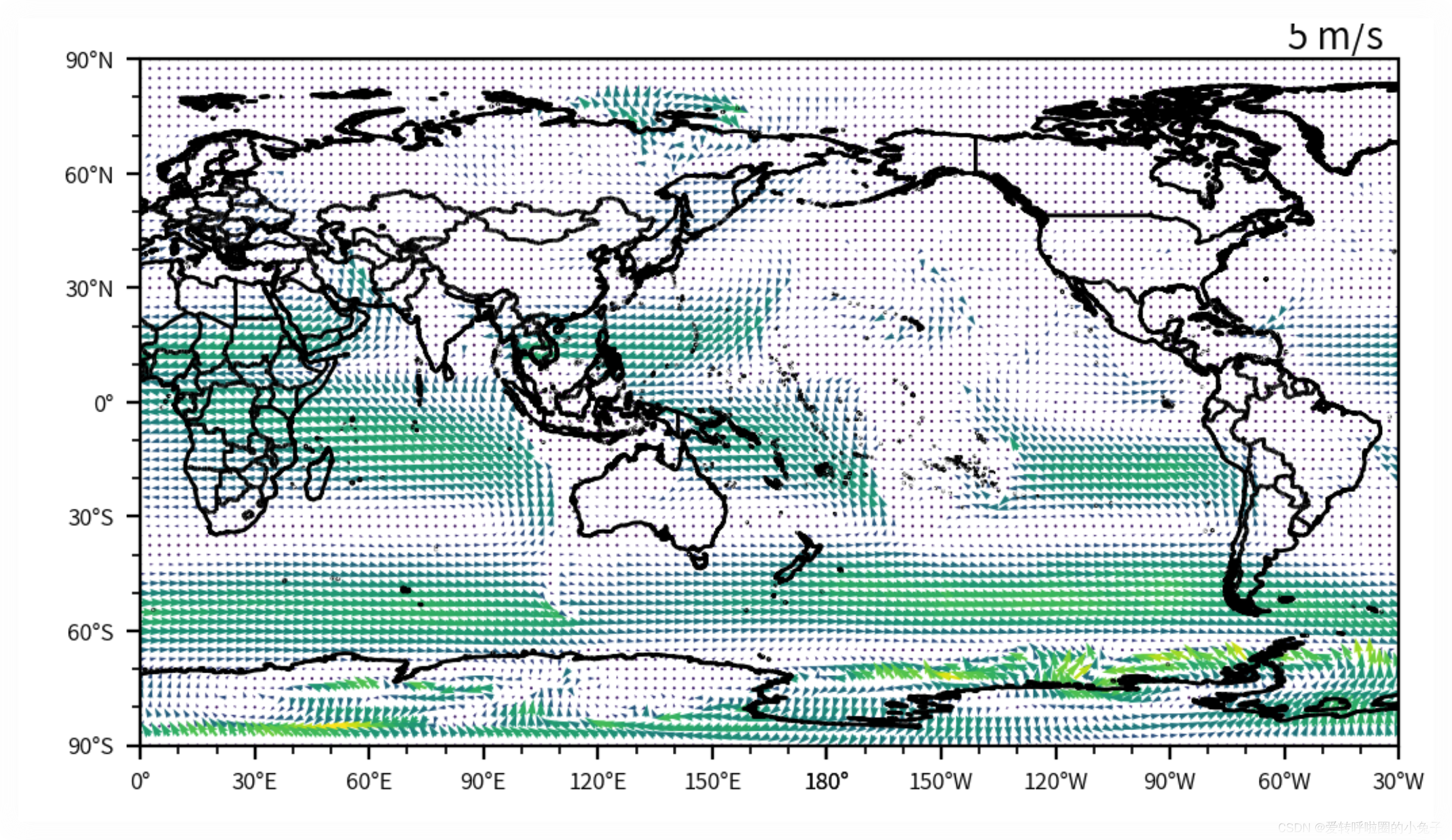
可以看到虽然绘制出了风场的图像,但是由于数据本身分辨率过高导致风场的图像并不是很直观,且风场的图标颜色不是很合适。因此,下面对风场进行微调,绘制出更加规范的图像。
import matplotlib.pyplot as plt
import matplotlib.ticker as ticker
import cartopy.crs as ccrs
import cartopy.feature as cfeature
from matplotlib.gridspec import GridSpec

fig = plt.figure(figsize=(6, 5), dpi=200)
gs = GridSpec(1, 1, figure=fig)
ax = fig.add_subplot(gs[0, 0], projection=ccrs.PlateCarree(central_longitude=180))

leftlon, rightlon, lowerlat, upperlat = (-180, 180, -90, 90)  # 设置全球地图范围
img_extent = [leftlon, rightlon, lowerlat, upperlat]
lon = u10_ana.longitude
lat = u10_ana.latitude

ax.quiver(lon[::20], lat[::20], u10_ana[::20, ::20], v10_ana[::20, ::20], windspeed_ana[::20, ::20], color="black",
          )
ax.quiverkey(d, 0.95, 1.1, 5, '5 m/s', labelpos='S', coordinates='axes')
ax.add_feature(cfeature.BORDERS.with_scale('10m'))
ax.add_feature(cfeature.COASTLINE.with_scale('10m'))
ax.set_extent(img_extent, crs=ccrs.PlateCarree())  # 设置地图显示范围为全球

ax.set_xticks([-180, -150, -120, -90, -60, -30, 0, 30, 60, 90, 120, 150, 180], crs=ccrs.PlateCarree())
ax.set_xticklabels(["180°W", "150°W", "120°W", "90°W", "60°W", "30°W", "0°", "30°E", "60°E", "90°E", "120°E", "150°E", "180°"],
                   rotation=0, fontsize=6)
ax.set_yticks([-90, -60, -30, 0, 30, 60, 90], crs=ccrs.PlateCarree())
ax.set_yticklabels(["90°S", "60°S", "30°S", "0°", "30°N", "60°N", "90°N"], rotation=0, fontsize=6)

ax.minorticks_on()
ax.xaxis.set_minor_locator(ticker.MultipleLocator(10))
ax.yaxis.set_minor_locator(ticker.MultipleLocator(10))

plt.show()
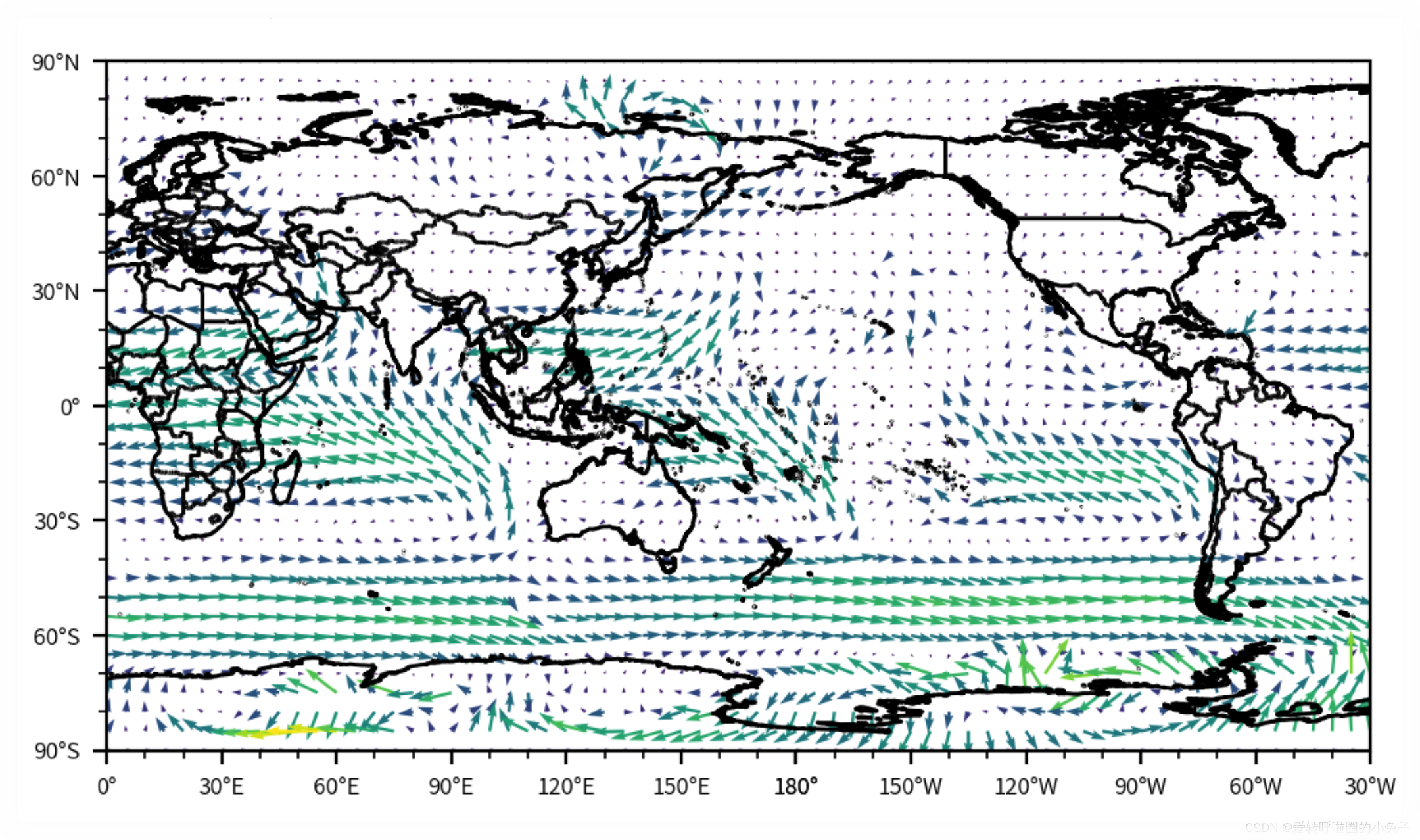
可以看到当我们调整了ax.quiver(lon[::20], lat[::20], u10_ana[::20, ::20], v10_ana[::20, ::20], windspeed_ana[::20, ::20], color="black")语句之后,图片变得更加规范了,但是风场的颜色依旧没有发生变化,这个又该怎么办呢?
这里解释一下,虽然我们使用函数对箭头的颜色进行了设置,但是Matplotlib还是会根据风速的大小绘制不同颜色的箭头,而如果要绘制统一颜色或者自定义箭头的颜色就需要自定义色标,然后利用cmap这个参数了。下面,展示使用cmap参数将所有箭头设置为黑色。
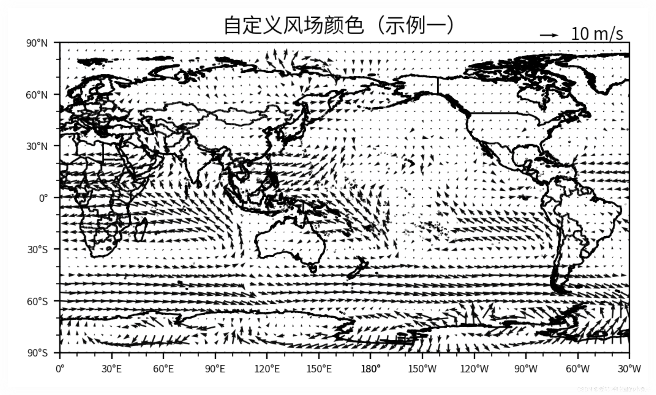
自定义色标
newcolors = [[0.03921, 0.03921, 0.03529]]
newcmap_1 = ListedColormap(newcolors)
newcmap_1

import matplotlib.pyplot as plt
import matplotlib.ticker as ticker
import cartopy.crs as ccrs
import cartopy.feature as cfeature
from matplotlib.gridspec import GridSpec

fig = plt.figure(figsize=(6, 5), dpi=200)
gs = GridSpec(1, 1, figure=fig)
ax = fig.add_subplot(gs[0, 0], projection=ccrs.PlateCarree(central_longitude=180))

leftlon, rightlon, lowerlat, upperlat = (-180, 180, -90, 90)  # 设置全球地图范围
img_extent = [leftlon, rightlon, lowerlat, upperlat]
lon = u10_ana.longitude
lat = u10_ana.latitude

d = ax.quiver(lon[::20], lat[::20], u10_ana[::20, ::20], v10_ana[::20, ::20], windspeed_ana[::20, ::20], cmap=newcmap_1)
ax.quiverkey(d,0.875, 1.025, 10, '10 m/s', labelpos='E', coordinates='axes', color="k") # 设置箭头示例颜色
ax.add_feature(cfeature.BORDERS.with_scale('10m'))
ax.add_feature(cfeature.COASTLINE.with_scale('10m'))
ax.set_extent(img_extent, crs=ccrs.PlateCarree())  # 设置地图显示范围为全球

ax.set_xticks([-180, -150, -120, -90, -60, -30, 0, 30, 60, 90, 120, 150, 180], crs=ccrs.PlateCarree())
ax.set_xticklabels(["180°W", "150°W", "120°W", "90°W", "60°W", "30°W", "0°", "30°E", "60°E", "90°E", "120°E", "150°E", "180°"],
                   rotation=0, fontsize=6)
ax.set_yticks([-90, -60, -30, 0, 30, 60, 90], crs=ccrs.PlateCarree())
ax.set_yticklabels(["90°S", "60°S", "30°S", "0°", "30°N", "60°N", "90°N"], rotation=0, fontsize=6)

ax.minorticks_on()
ax.xaxis.set_minor_locator(ticker.MultipleLocator(10))
ax.yaxis.set_minor_locator(ticker.MultipleLocator(10))
ax.set_title("自定义风场颜色(示例一)")
plt.show()
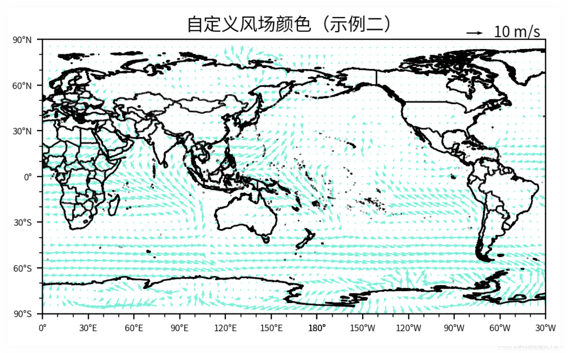
将箭头更改为其他颜色
newcolors = [[0.545098, 0.941176, 0.878431]]
newcmap_2 = ListedColormap(newcolors)

newcmap_2
import matplotlib.pyplot as plt
import matplotlib.ticker as ticker
import cartopy.crs as ccrs
import cartopy.feature as cfeature
from matplotlib.gridspec import GridSpec

fig = plt.figure(figsize=(6, 5), dpi=200)
gs = GridSpec(1, 1, figure=fig)
ax = fig.add_subplot(gs[0, 0], projection=ccrs.PlateCarree(central_longitude=180))

leftlon, rightlon, lowerlat, upperlat = (-180, 180, -90, 90)  # 设置全球地图范围
img_extent = [leftlon, rightlon, lowerlat, upperlat]
lon = u10_ana.longitude
lat = u10_ana.latitude

d = ax.quiver(lon[::20], lat[::20], u10_ana[::20, ::20], v10_ana[::20, ::20], windspeed_ana[::20, ::20], cmap=newcmap_2)
ax.quiverkey(d,0.875, 1.025, 10, '10 m/s', labelpos='E', coordinates='axes', color="k") # 设置箭头示例颜色
ax.add_feature(cfeature.BORDERS.with_scale('10m'))
ax.add_feature(cfeature.COASTLINE.with_scale('10m'))
ax.set_extent(img_extent, crs=ccrs.PlateCarree())  # 设置地图显示范围为全球

ax.set_xticks([-180, -150, -120, -90, -60, -30, 0, 30, 60, 90, 120, 150, 180], crs=ccrs.PlateCarree())
ax.set_xticklabels(["180°W", "150°W", "120°W", "90°W", "60°W", "30°W", "0°", "30°E", "60°E", "90°E", "120°E", "150°E", "180°"],
                   rotation=0, fontsize=6)
ax.set_yticks([-90, -60, -30, 0, 30, 60, 90], crs=ccrs.PlateCarree())
ax.set_yticklabels(["90°S", "60°S", "30°S", "0°", "30°N", "60°N", "90°N"], rotation=0, fontsize=6)

ax.minorticks_on()
ax.xaxis.set_minor_locator(ticker.MultipleLocator(10))
ax.yaxis.set_minor_locator(ticker.MultipleLocator(10))
ax.set_title("自定义风场颜色(示例二)")
plt.show()
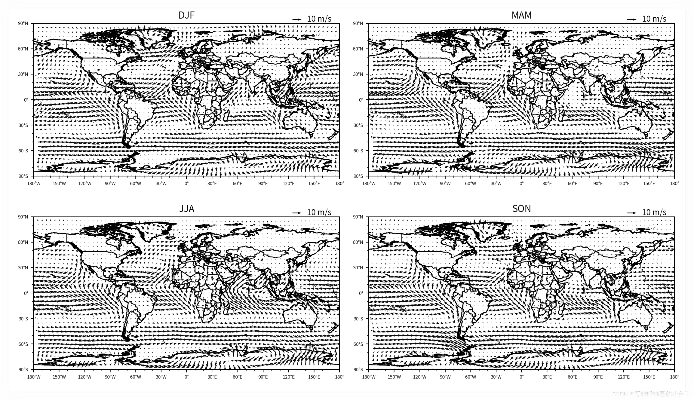
三、绘制每个季节的平均风场
import xarray as xr
import numpy as np
import pandas as pd
import matplotlib as mpl
import matplotlib.pyplot as plt
import cartopy.crs as ccrs
import cartopy.feature as cfeature
from matplotlib.offsetbox import AnchoredText
from matplotlib.colors import ListedColormap
import cmaps
import matplotlib.ticker as ticker
from matplotlib.gridspec import GridSpec
from cartopy.mpl.geoaxes import GeoAxes
from mpl_toolkits.axes_grid1 import AxesGrid
import datetime as dt

fig = plt.figure(layout="constrained", figsize=(12, 7), dpi=200)
gs = GridSpec(2, 2, figure=fig)

proj = ccrs.PlateCarree(central_longitude=180)
leftlon, rightlon, lowerlat, upperlat = (-180, 180, -90, 90)
img_extent = [leftlon, rightlon, lowerlat, upperlat]

lon = u10.longitude
lat = u10.latitude

seasons = [(0, 3, "DJF"), (3, 6, "MAM"), (6, 9, "JJA"), (9, 12, "SON")]

for i, (start, end, title) in enumerate(seasons):
    ax = fig.add_subplot(gs[i // 2, i % 2], projection=ccrs.PlateCarree())
    u10_sea = u10[start:end, :, :].mean(axis=0)
    v10_sea = v10[start:end, :, :].mean(axis=0)
    windspeed_sea = np.sqrt(u10_sea**2+v10_sea**2)

    d = ax.quiver(lon[::20], lat[::20], u10_sea[::20, ::20], v10_sea[::20, ::20], windspeed_sea[::20, ::20], cmap=newcmap_1)
    ax.quiverkey(d, 0.875, 1.025, 10, '10 m/s', labelpos='E', coordinates='axes', color="k")
    ax.add_feature(cfeature.BORDERS.with_scale('10m'))
    ax.add_feature(cfeature.COASTLINE.with_scale('10m'))
    ax.set_extent(img_extent, crs=ccrs.PlateCarree())

    ax.set_xticks([-180, -150, -120, -90, -60, -30, 0, 30, 60, 90, 120, 150, 180], crs=ccrs.PlateCarree())
    ax.set_xticklabels(["180°W", "150°W", "120°W", "90°W", "60°W", "30°W", "0°", "30°E", "60°E", "90°E", "120°E", "150°E", "180°"],
                       rotation=0, fontsize=6)
    ax.set_yticks([-90, -60, -30, 0, 30, 60, 90], crs=ccrs.PlateCarree())
    ax.set_yticklabels(["90°S", "60°S", "30°S", "0°", "30°N", "60°N", "90°N"], rotation=0, fontsize=6)

    ax.minorticks_on()
    ax.xaxis.set_minor_locator(ticker.MultipleLocator(10))
    ax.yaxis.set_minor_locator(ticker.MultipleLocator(10))
    ax.set_title(title)

plt.tight_layout()
plt.show()
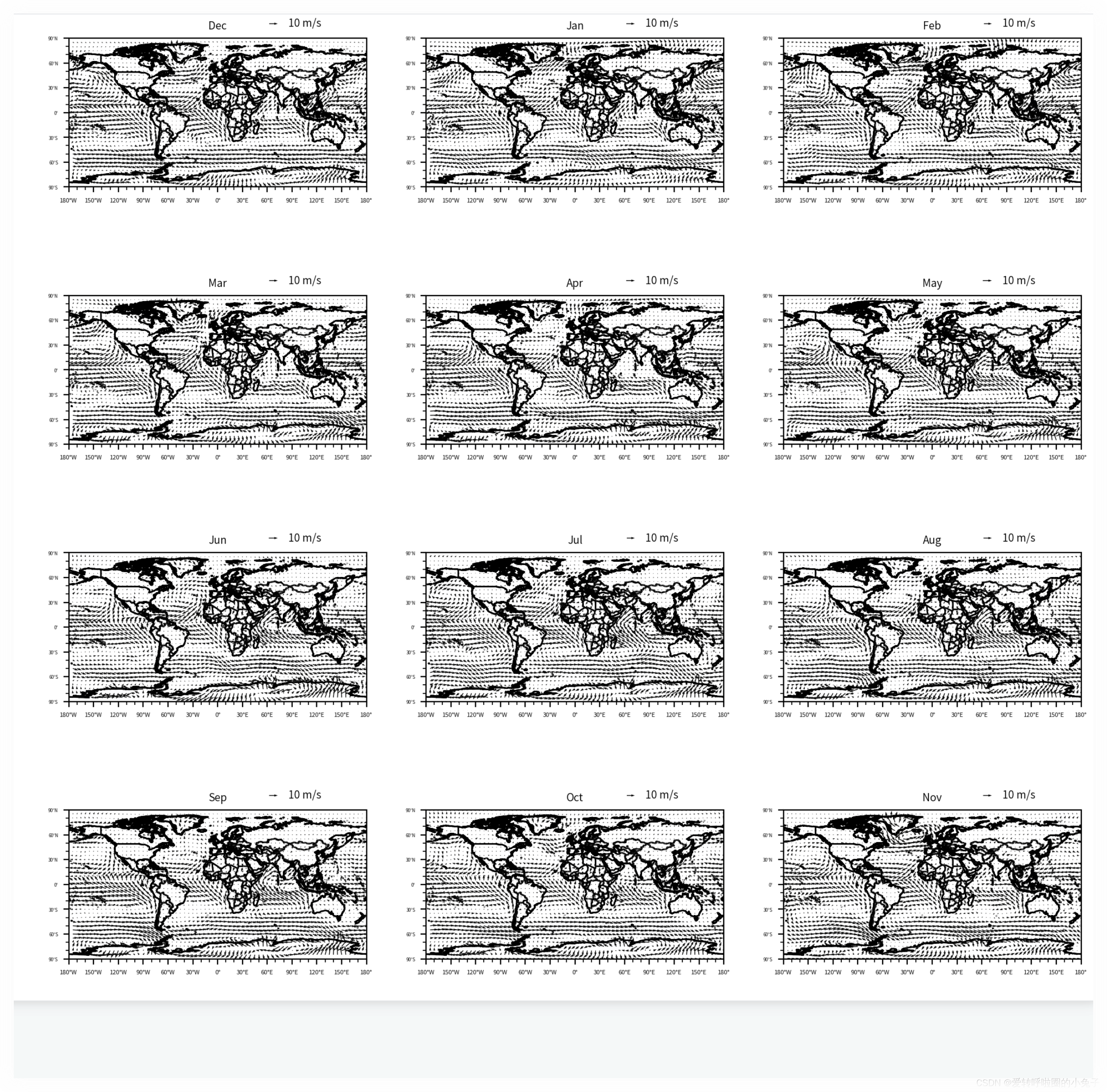
四、绘制每个月的风场
import matplotlib.pyplot as plt
import matplotlib.ticker as ticker
import cartopy.crs as ccrs
import cartopy.feature as cfeature
from matplotlib.gridspec import GridSpec

fig = plt.figure(figsize=(12, 12), dpi=200)
gs = GridSpec(4, 3, figure=fig)

proj = ccrs.PlateCarree(central_longitude=180)
leftlon, rightlon, lowerlat, upperlat = (-180, 180, -90, 90)
img_extent = [leftlon, rightlon, lowerlat, upperlat]

lon = u10.longitude
lat = u10.latitude

months = list(zip(np.arange(12), ['Dec','Jan', 'Feb', 'Mar', 'Apr', 'May', 'Jun', 'Jul', 'Aug', 'Sep', 'Oct', 'Nov']))


for i, (month, title) in enumerate(months):
    ax = fig.add_subplot(gs[i // 3, i % 3], projection=ccrs.PlateCarree())
    u10_mon = u10[month, :, :]
    v10_mon = v10[month, :, :]
    windspeed_mon = np.sqrt(u10_mon**2+v10_mon**2)

    d = ax.quiver(lon[::20], lat[::20], u10_mon[::20, ::20], v10_mon[::20, ::20], windspeed_mon[::20, ::20], cmap=newcmap_1)
    ax.quiverkey(d, 0.7, 1.1, 10, '10 m/s', labelpos='E', coordinates='axes', color="k", fontproperties={"size":7})
    ax.add_feature(cfeature.BORDERS.with_scale('10m'))
    ax.add_feature(cfeature.COASTLINE.with_scale('10m'))
    ax.set_extent(img_extent, crs=ccrs.PlateCarree())

    ax.set_xticks([-180, -150, -120, -90, -60, -30, 0, 30, 60, 90, 120, 150, 180], crs=ccrs.PlateCarree())
    ax.set_xticklabels(["180°W", "150°W", "120°W", "90°W", "60°W", "30°W", "0°", "30°E", "60°E", "90°E", "120°E", "150°E", "180°"],
                       rotation=0, fontsize=4)
    ax.set_yticks([-90, -60, -30, 0, 30, 60, 90], crs=ccrs.PlateCarree())
    ax.set_yticklabels(["90°S", "60°S", "30°S", "0°", "30°N", "60°N", "90°N"], rotation=0, fontsize=3)

    ax.minorticks_on()
    ax.xaxis.set_minor_locator(ticker.MultipleLocator(10))
    ax.yaxis.set_minor_locator(ticker.MultipleLocator(10))
    ax.set_title(title, fontsize=7)
# plt.subplots_adjust(left=0.1, right=0.9, bottom=0.1, top=0.9)
# plt.tight_layout(pad=1.5)
plt.show()
数据及代码下载链接➡️:如何绘制自定义颜色的风场图