旋转的骰子(二)
1.动画——旋转的骰子
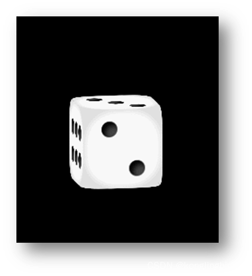
上一次我们做了一个旋转的骰子(参看第2讲),这次我们想要点击按钮,让骰子旋转到特定的点数停下来!
2.分析需求——庖丁解牛
a.立方体特定的朝向对应着特定的旋转角度
骰子显示特定点数,无非就是旋转骰子,让特定点数的面朝向屏幕外侧
b.通过自定义属性控制旋转角度
利用css属性选择器,将特定属性值和骰子旋转样式,建立一一对应关系
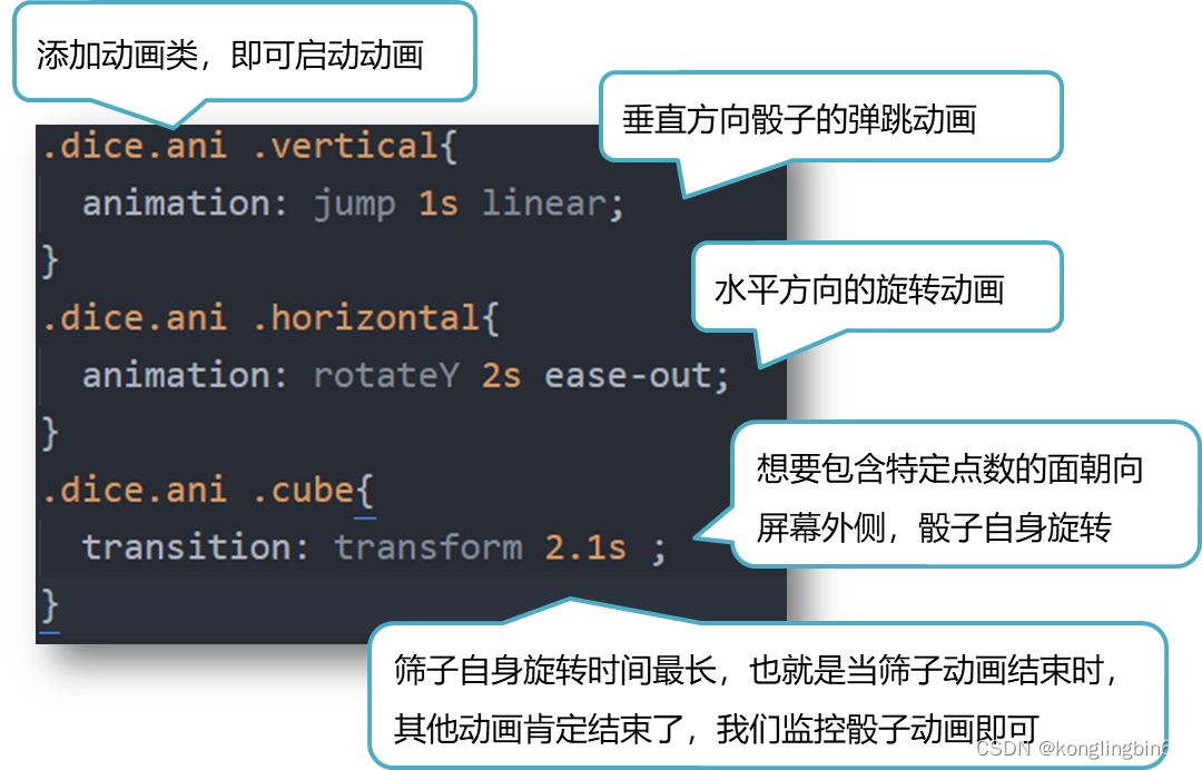
c.通过类进行动画控制
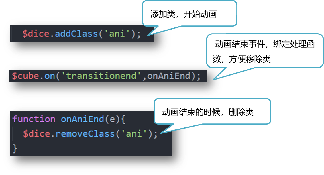
通过添加类,删除类,启动动画
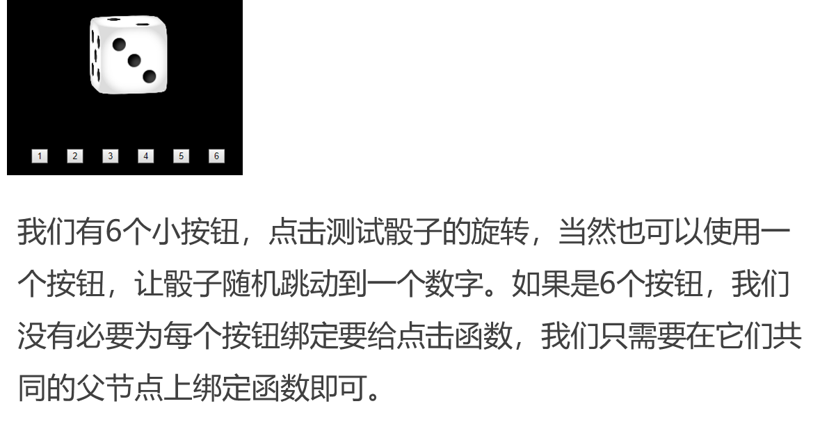
d.添加控制按钮,触发动画
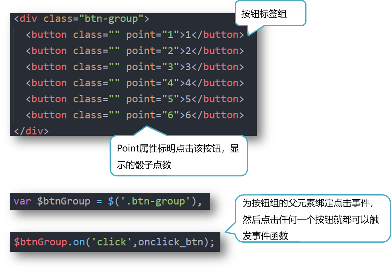
添加6个按钮,点击,触发筛子旋转,方便调试
3.旋转特定角度,露出特定平面
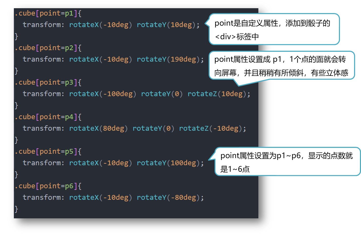
4.自定义属性的设置
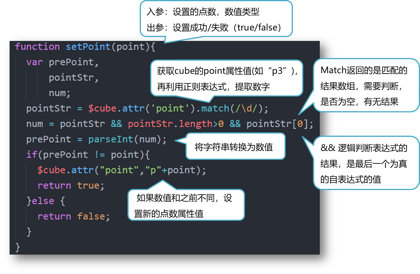
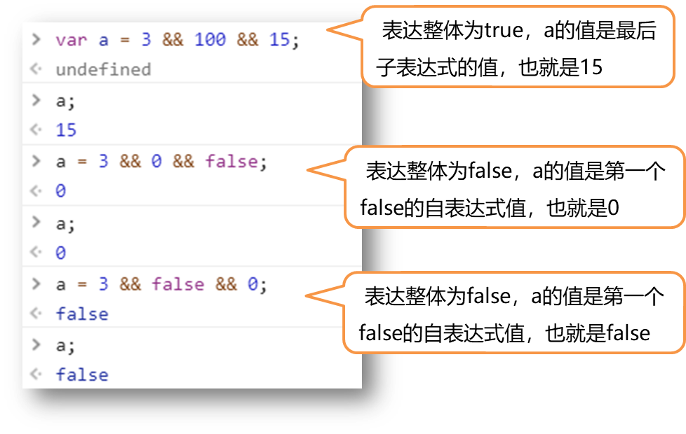
与表达式
“与”表达式(&&),准确的说是“逻辑与”表达式,形式为: A && B && C。
其中A,B,C为子表达式,子表达式数目不限,只有所有的子表达式都为true,整个表达式的值才为true.
判断为true的常见类型:
布尔值true,非零数值,对象,字符串
判断为false的常见类型:
布尔值false,数值0,空对象(null),未定义变量(undefine)
与表达式是可以赋值给给其他变量的,它的值的分两种情况:
•
如果整个表达式的值为
true
,则整个表达式的值,是
最后一个为
true
的,子表达式的值
;
•
如果表达式的值为
false
,
则整个表达式的值,为
第一个为
false
的子表达式的值
。
如下图所示
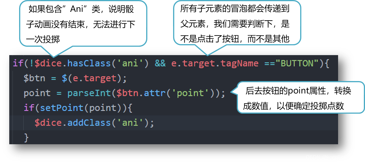
5.动画的开启/结束
 6.测试按钮
 7.更多思考
我们可以制作一个骰子,然后通过单一按钮,进行随机投掷,这样就变成了一个有趣的小游戏
8 代码
注意代码中引用jquery-1.12.4.js,可自行到官网下载
<!DOCTYPE html>
<html>
	<head>
		<meta charset="UTF-8"/>
		<title>Rotate Dice</title>
		<link rel="stylesheet" type="text/css" href="./styles.css"/>
	</head>
	<body>
		<div class="dice">
			<div class="vertical">
        <div class="horizontal">
          <div class="cube" point="">
            <div class="face front one">
              <span class="dot"></span>
            </div>
            <div class="face back two">
              <span class="dot"></span>
              <span class="dot"></span>
            </div>
            <div class="face up three">
              <span class="dot"></span>
              <span class="dot"></span>
              <span class="dot"></span>
            </div>
            <div class="face down four">
              <div class="dot-row">
                <span class="dot"></span>
                <span class="dot"></span>
              </div>
              <div class="dot-row">
                <span class="dot"></span>
                <span class="dot"></span>
              </div>
            </div>
            <div class="face left five">
              <div class="dot-row">
                <span class="dot"></span>
                <span class="dot"></span>
              </div>
              <div class="dot-row">
                <span class="dot"></span>
              </div>
              <div class="dot-row">
                <span class="dot"></span>
                <span class="dot"></span>
              </div>
            </div>
            <div class="face right six">
              <div class="dot-row">
                <span class="dot"></span>
                <span class="dot"></span>
                <span class="dot"></span>
              </div>
              <div class="dot-row">
                <span class="dot"></span>
                <span class="dot"></span>
                <span class="dot"></span>
              </div>
            </div>
            <div class="axis-face x"></div>
            <div class="axis-face y"></div>
            <div class="axis-face z"></div>
          </div>
				</div>
			</div>
		</div>
		<div class="btn-group">
			<button class="" point="1">1</button>
			<button class="" point="2">2</button>
			<button class="" point="3">3</button>
			<button class="" point="4">4</button>
			<button class="" point="5">5</button>
			<button class="" point="6">6</button>
		</div>
		<script src="./jquery-1.12.4.js"></script>
		<script src="./think.js"></script>
	</body>
</html>
html
{
	background-color: black;
	font-size:100px;
	padding: 1em;
	text-align: center;
}
.btn-group{
	display: inline-block;
}

/*骰子动画*/
.dice.ani .vertical{
	animation: jump 1s linear;
}
.dice.ani .horizontal{
	animation: rotateY 2s ease-out;
}
.dice.ani .cube{
	transition: transform 2.1s ;
}

@keyframes rotateY {
	from{transform:rotateY(0);}
	to{transform:rotateY(1800deg);}
}
/*@keyframes rotateX {
	from{transform:rotateX(0);}
	to{transform:rotateX(3600deg);}
}*/
@keyframes jump {
		from{transform: translateY(-3.6em);}
		30%{transform: translateY(-3em);}
		60%{transform: translateY(0);}
		70%{transform: translateY(-1.5em);}
		80%{transform: translateY(0);}
		90%{transform: translateY(-.6em);}
		to,10%{transform: translateY(0);}
}

/*转到对应点数的动画*/
.cube{
	transform: rotateX(-10deg) rotateY(10deg);
}
.cube[point=p1]{
  transform: rotateX(-10deg) rotateY(10deg);
}
.cube[point=p2]{
  transform: rotateX(-10deg) rotateY(190deg);
}
.cube[point=p3]{
  transform: rotateX(-100deg) rotateY(0) rotateZ(10deg);
}
.cube[point=p4]{
  transform: rotateX(80deg) rotateY(0) rotateZ(-10deg);
}
.cube[point=p5]{
  transform: rotateX(-10deg) rotateY(100deg);
}
.cube[point=p6]{
  transform: rotateX(-10deg) rotateY(-80deg);
}

/*面的样式*/
.dice,.vertical,.horizontal,.cube,.face{
	transform-style:preserve-3d;
}
.dice,.vertical,.horizontal,.cube,.face,.face::after,.axis-face{
	width:1em;
	height: 1em;
}
.dice{
	margin: auto;
}
.cube{
  position: relative;
}
.face,.face::after,.axis-face{
	position: absolute;
  top:0;
  left: 0;
}
.face{
	box-sizing: border-box;
  padding: .15em;
  background-color: white;
  border-radius: 40%;
  box-shadow: 0 0 .2em #ccc inset;
}
.face::after{
  content:"";
  display: block;
  border-radius: .2em;
  transform: translateZ(-.1px);
  background-color: #e0e0e0;
}
.axis-face{
  background:#e0e0e0;
}

/*点的样式*/
.dot{
  width:.2em;
  height: .2em;
  display: inline-block;
  background: #444;
  border-radius: 50%;
  box-shadow: inset .05em .05em .1em black;
}
/* 面的方位*/
.face.front{
  transform: translateZ(.5em);
}
.face.back{
  transform: translateZ(-.5em) rotateY(180deg);
}
.face.up{
  transform: translateY(-50%) rotateX(90deg);
}
.face.down{
  transform: translateY(50%) rotateX(-90deg);
}
.face.left{
  transform: translateX(-50%) rotateY(-90deg);
}
.face.right{
  transform: translateX(50%) rotateY(90deg);
}
.axis-face.x{
  transform:rotateY(90deg);
}
.axis-face.y{
  transform:rotateX(90deg);
}
.axis-face.z{
}

/* 点的排列布局*/
.face,.dot-row{
  display: flex;
}
.face.one{
  align-items: center;
  justify-content: center;
}
.face.two{
  justify-content: space-around;
}
.face.two .dot:nth-child(2){
  align-self: flex-end;
}
.face.three{
  justify-content: space-around;
}
.face.three .dot:nth-child(2){
  align-self:center;
}
.face.three .dot:nth-child(3){
  align-self: flex-end;
}
.face.four{
  flex-direction: column;
  justify-content: space-between;
}
.face.four .dot-row{
  justify-content: space-between;
}
.face.five{
  flex-direction: column;
  justify-content: space-between;
}
.face.five .dot-row{
  justify-content: space-between;
}
.face.five .dot-row:nth-child(2){
  justify-content:center;
}
.face.six{
  flex-direction: column;
  justify-content: space-around;
}
.face.six .dot-row{
  justify-content: space-between;
}
jQuery(function($){
	var $btnGroup = $('.btn-group'),
			$cube = $('.cube'),
			$dice = $('.dice');
	$btnGroup.on('click',onclick_btn);
	$cube.on('transitionend',onAniEnd);

	function onclick_btn(e){
		var point,
				$btn;
		if(!$dice.hasClass('ani') && e.target.tagName =="BUTTON"){
			$btn = $(e.target);
			point = parseInt($btn.attr('point'));
			if(setPoint(point)){
				$dice.addClass('ani');
			}
		}
	}
	function setPoint(point){
		var prePoint,
				pointStr,
				num;
		pointStr = $cube.attr('point').match(/\d/);
		num = pointStr && pointStr.length>0 && pointStr[0];
		prePoint = parseInt(num);
		if(prePoint != point){
			$cube.attr("point","p"+point);
			return true;
		}else {
			return false;
		}
	}
	function onAniEnd(e){
		$dice.removeClass('ani');
	}

});