Flutter之自定义顶部Tab——Flutter基础系列
需求:
顶部导航条的功能实现。
一、普通顶部导航栏
效果图:
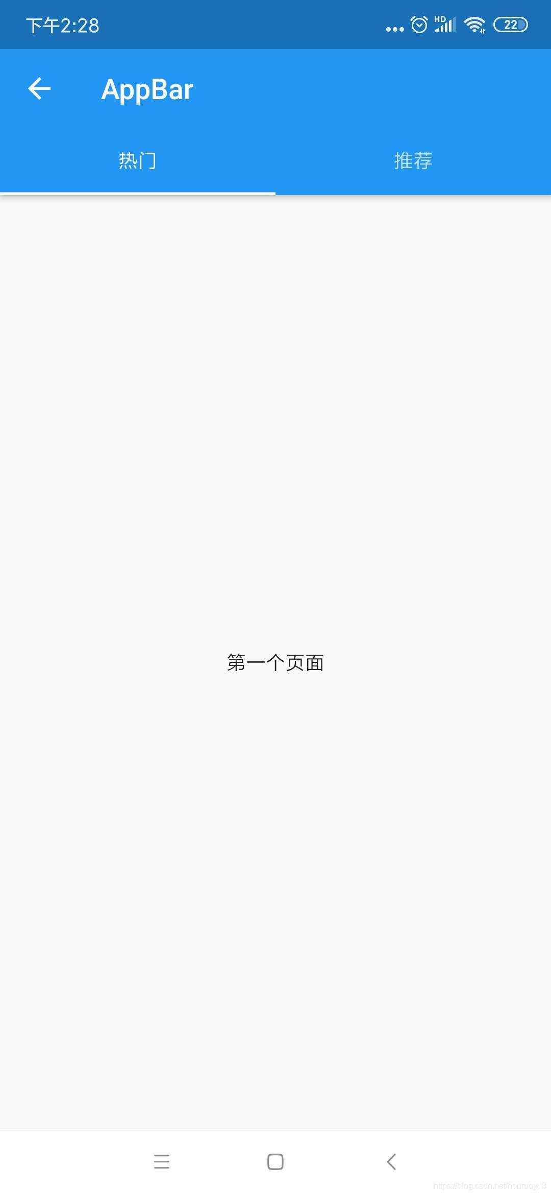
DefaultTabController(
      length: 2,    //配置顶部tab的数量
      child: Scaffold(
        appBar: AppBar(
          title: Text("普通顶部导航栏"),
          bottom: TabBar(
              tabs: <Widget>[
                Tab(text: "热门"),
                Tab(text: "推荐"),
              ]
          ),
        ),
        body: TabBarView(  //点击bar对应的内容,第一个组件对应第一个bar,第二个对应第二个,以此类推
          children: [
            Center(
              child: Text("第一个页面"),
            ),
            Center(
              child: Text("第二个页面"),
            )
          ],
        ),
      ),
    );
二、TabBar放在导航最顶部
比如已经设置底部导航栏再设置其中页面的顶部导航栏 出现问题: 因为底部导航栏已经使用过Scaffold设置了顶部栏目主题信息,再使用顶部导航栏 时候还要使用Scaffold设置,这就导致了会有两个顶部栏目,即两个标题
解决方案: 将顶部导航栏的内容放置自身Scaffold的title中,而不是放到bottom中
效果图:
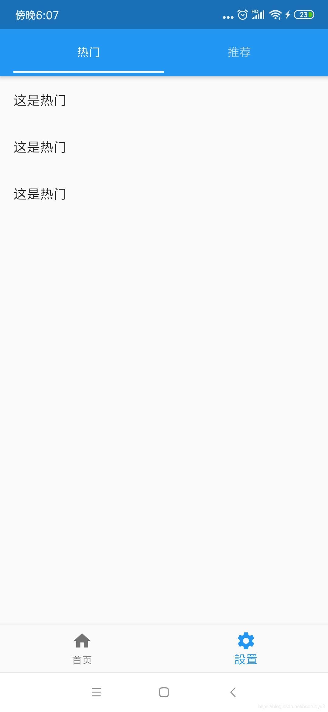
DefaultTabController(
      length: 2,
      child: Scaffold(
        appBar: AppBar(
          automaticallyImplyLeading:false,   //去掉顶部返回按钮
          title: Row(   //因为title接收组件,故在title中设置导航栏
            children: <Widget>[
              Expanded(
                  child: TabBar(
                    tabs: <Widget>[
                      Tab(text: '分类1'),
                      Tab(text: '分类2',)
                    ],
                  )
              )
            ],
          ),
        ),
        body:TabBarView(
          children: <Widget>[
            Text('分类111'),
            Text('分类222')
          ],
        ),
      ),
    );
顶部导航栏参数配置
在TabBar中与tabs同级设置
              isScrollable: false,   //是否可滚动
              indicatorColor: Colors.red,  //bar的下划线指示器选中颜色
              indicatorWeight: 3, //bar的下划线指示器的高度
              indicatorPadding:  EdgeInsets.all(8.0),  //bar的下划线指示器的padding
              labelColor: Colors.yellow,  //标签文字颜色
              indicatorSize: TabBarIndicatorSize.label, //下划线指示器与标签文字等宽,默认为tab与bar等宽
              labelStyle: TextStyle(), //标签文字样式
              labelPadding:  EdgeInsets.only(left: 8.0), //标签文字padding
              unselectedLabelColor: Colors.white,   //未选中文字标签颜色
              unselectedLabelStyle: TextStyle(),  //未选中文字标签样式
基础篇
------------------------------------------------------------
Flutter之自定义底部导航条以及页面切换实例——Flutter基础系列
Flutter之抽屉组件drawer,设置drawer宽度——Flutter基础系列
Flutter之自定义按钮RaisedButton、OutlineButton、IconButton等——Flutter基础系列