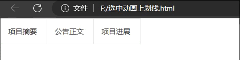
1.实现效果
2.代码实现
<!DOCTYPE html>
<html>
<head>
  <meta charset="utf-8">
  <meta name="viewport" content="width=device-width, initial-scale=1, maximum-scale=1">
  <title>采购公告布局</title>
  <link rel="stylesheet" href="https://www.layuicdn.com/layui-v2.8.0-rc.9/css/layui.css">

</head>

<style type="text/css">
.center-to-head{
    position:relative;
    width: 60px;
    padding: 15px;
    float: left;
    border-top:1.2px solid #e8e8e8;
    border-right:1.2px solid #e8e8e8;
    border-bottom:1.2px solid #e8e8e8;

  }
  .center-to-head::after{
    left:0;
    content:'';
    display:block;
    /*开始时候下划线的宽度为100%*/
    width:100%;
    height:3px;
    position:absolute;
    top:0px;
    background:#ff8d1a;
    transition:all 0.3s ease-in-out;
    /*通过transform的缩放scale来让初始时x轴为0*/
    transform: scale3d(0,0,0);
    /*将坐标原点移到元素的中间,以原点为中心进行缩放*/
    transform-origin:50% 0;
  }
  .center-to-head:hover::after{
    /*鼠标经过时还原到正常比例*/
    transform:scale3d(1,1,1);
  }

</style>


<body>
    <div id="text-title" class="text-title" style="width: 100%;height: 50px;">
        <a href="#xmzy" class="center-to-head ">项目摘要</a>
        <a href="#ggzw" class="center-to-head">公告正文</a>
        <a href="#xmjz" class="center-to-head">项目进展</a>
    </div>
</body>