利用CSS关键帧实现文字动态背景
在网页中我们时常会看到很多动效,这对我们还是很有吸引力的,今天我就看到一个文字动态背景的效果,思考了一下该怎么实现。
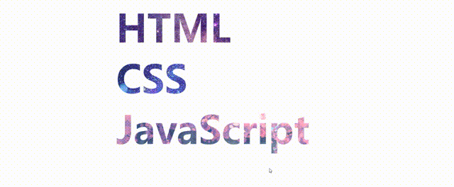
效果图如下:
一、实现思路
1.看见这种动画效果,首席想到的就是在文字下面添加一个背景图片,然后利用文字颜色样式将文字颜色设置为透明,然后裁剪掉文字以外的背景,最后让图片动起来(这个可以用css3中的关键帧实现)就完成了。
二、代码示例
2.1 HTML结构部分:
<body>
    <div class="text1 text">HTML</div>
    <div class="text2 text">CSS</div>
    <div class="text3 text">JavaScript</div>
</body>
放置3个div,设置相应的类名,然后文字部分写上你想要展示的文字。
2.2 CSS样式部分
<style>
        .text {
            width: 800px;
            font-size: 120px;
            font-weight: 900;
            margin: auto;
            color: transparent;
        }

        .text1 {
            background: url(./img/04.jpg);
            -webkit-background-clip: text;
            animation: moveImg 7s infinite alternate linear;
        }

        .text2 {
            background: url(./img/03.png);
            -webkit-background-clip: text;
            animation: moveImg 5s infinite alternate linear;
        }

        .text3 {
            background: url(./img/01.jpg);
            -webkit-background-clip: text;
            animation: moveImg 8s infinite alternate linear;
        }

        @keyframes moveImg {
            0% {
                background-position: 0%;
            }

            50% {
                background-position: 50%;
            }

            100% {
                background-position: 100%;
            }
        }
    </style>
1. 给上公共样式,再分别给每个div盒子设置背景图片(图片的话,可以自己找一些好看的图片放上去),
2. 每个div的样式部分为,设置背景图片,以文本的格式裁剪背景图片(这里要注意的一点是,裁剪图片(-webkit-background-clip: text;)这个代码一定要放在设置背景图片的后面,否则没有效果)前缀-webkit-表示webkit内核浏览器(Chrome、Safari和opera)
3. 最后在写一个关键帧(Keyframe),来设置背景的定位,从0%到100%,通过动画animation来实现。
这里第一个参数:是动画名称,
第二个参数:持续时间 必须带上时间单位,s或者ms均可;,
第三个参数:循环次数 infinite为无限循环,
第四个参数:alternate是动画先正常运行再反方向运行,并持续交替运行,
第五个参数:动画过渡方式 linear为线性过渡。(具体的animation属性可以去CMD官网查询了解)。
这样一个文字动态背景的特效就实现了
三、代码总结
<!DOCTYPE html>
<html lang="en">

<head>
    <meta charset="UTF-8">
    <meta http-equiv="X-UA-Compatible" content="IE=edge">
    <meta name="viewport" content="width=device-width, initial-scale=1.0">
    <title>文字动态背景</title>
    <style>
        .text {
            width: 800px;
            font-size: 120px;
            font-weight: 900;
            margin: auto;
            color: transparent;
        }

        .text1 {
            background: url(./img/04.jpg);
            -webkit-background-clip: text;
            animation: moveImg 7s infinite alternate linear;
        }

        .text2 {
            background: url(./img/03.png);
            -webkit-background-clip: text;
            animation: moveImg 5s infinite alternate linear;
        }

        .text3 {
            background: url(./img/01.jpg);
            -webkit-background-clip: text;
            animation: moveImg 8s infinite alternate linear;
        }

        @keyframes moveImg {
            0% {
                background-position: 0%;
            }

            50% {
                background-position: 50%;
            }

            100% {
                background-position: 100%;
            }
        }
    </style>
</head>

<body>
    <div class="text1 text">HTML</div>
    <div class="text2 text">CSS</div>
    <div class="text3 text">JavaScript</div>
</body>

</html>