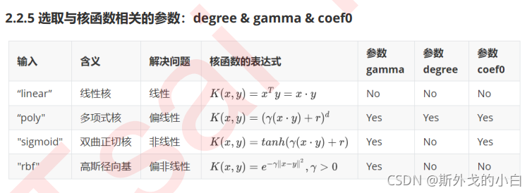
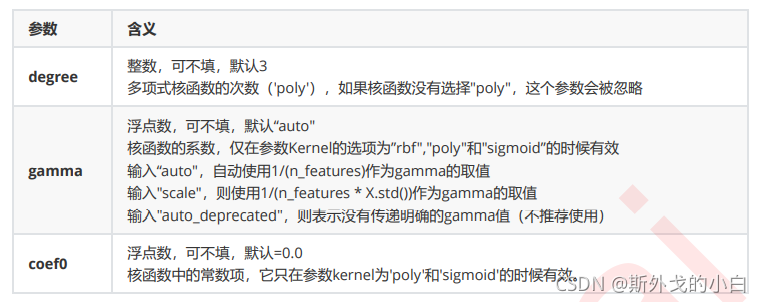
支持向量机(二)重要参数kernel+探索核函数在不同数据集上的表现+乳腺癌数据集上验证各种核函数的效果+硬间隔和软间隔以及重要的参数C
1 重要参数kernel


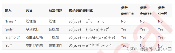
之前画图时使用的是选项“linear",自然不能处理环形数据这样非线性的状况。而刚才我们使用的计算r的方法,其实是高斯径向基核函数所对应的功能,在参数”kernel“中输入”rbf“就可以使用这种核函数。
from sklearn.svm import SVC
import matplotlib.pyplot as plt
import numpy as np
from sklearn.datasets import make_circles
from mpl_toolkits import mplot3d
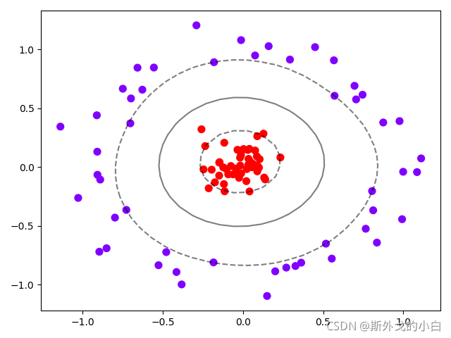
x, y = make_circles(100, factor=0.1, noise=0.1)
clf_1 = SVC(kernel="rbf").fit(x,y)
plt.scatter(x[:, 0], x[:, 1], c=y, s=50, cmap="rainbow")
plot_scv_decision_function(clf_1)
plt.show()
2 探索核函数在不同数据集上的表现
import numpy as np
import matplotlib.pyplot as plt
from matplotlib.colors import ListedColormap
from sklearn.svm import SVC
from sklearn.datasets import make_circles, make_moons, make_blobs, make_classification
n_samples = 100
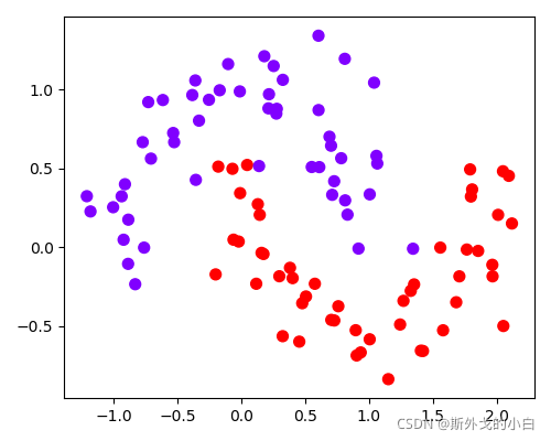
datasets = [make_moons(n_samples=n_samples, noise=0.2, random_state=0),
make_circles(n_samples=n_samples, noise=0.2, factor=0.5, random_state=1),
make_blobs(n_samples=n_samples, centers=2, random_state=5),
make_classification(n_samples=n_samples, n_features=2, n_informative=2, n_redundant=0, random_state=5)]
kenerls = ["linear", "poly", "rbf", "sigmoid"]
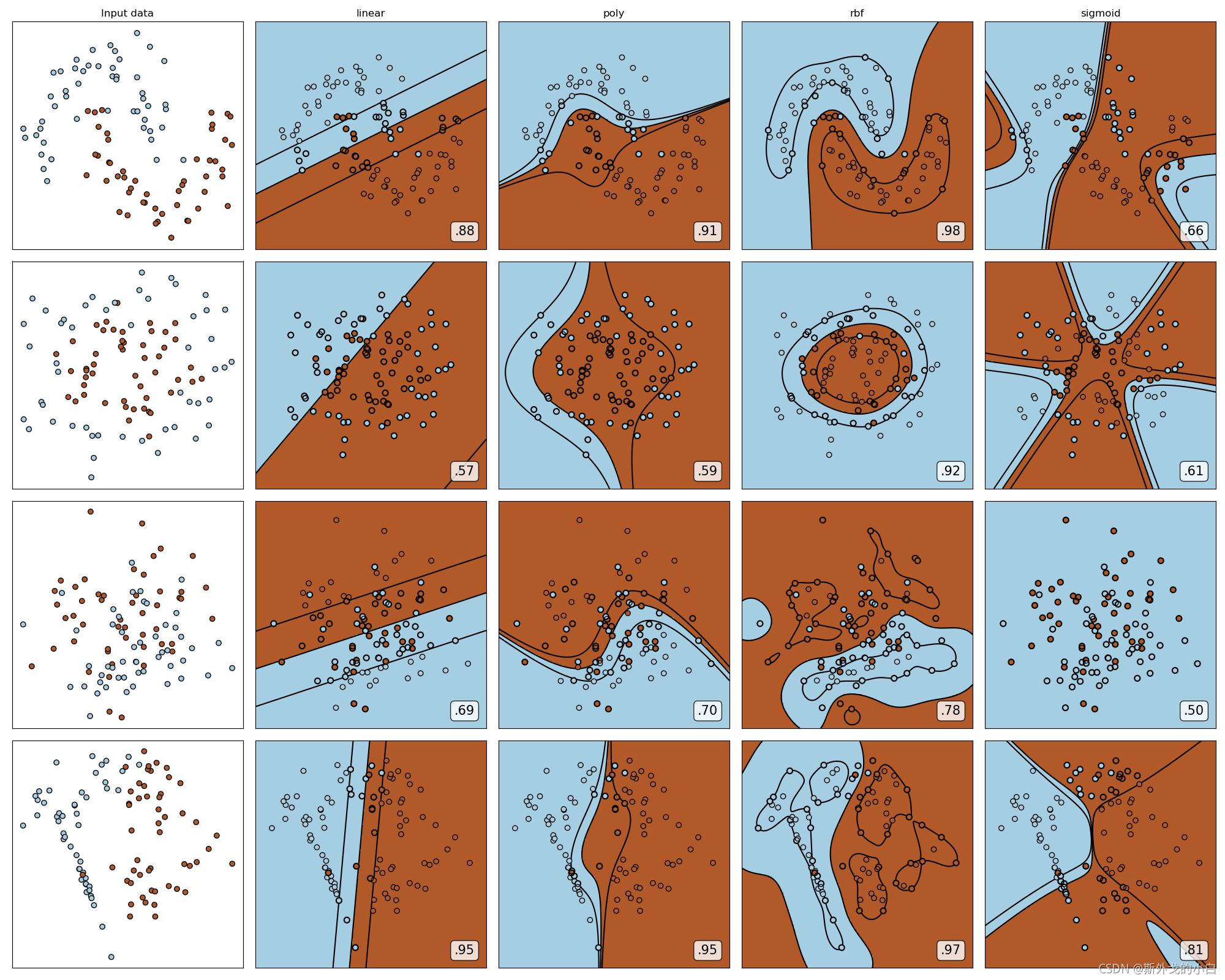
#四个数据集分别是什么样的嘞?
for x, y in datasets:
plt.figure(figsize=(5, 4))
plt.scatter(x[:, 0], x[:, 1], c=y, s=50, cmap="rainbow")
plt.show()
月亮型
环形
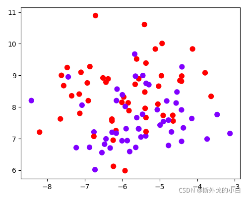
两簇交织在一起
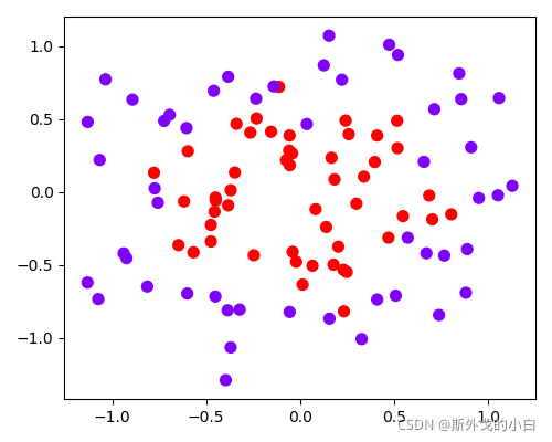
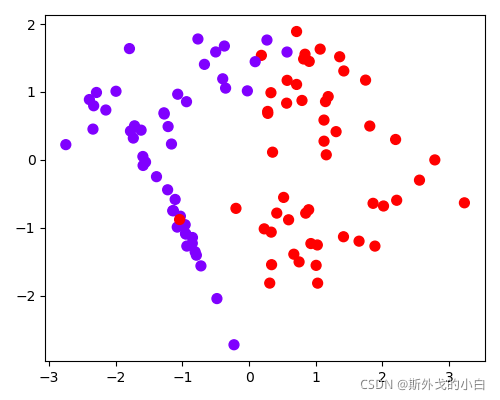
一半一半型
#构建子图的行和列
nrows = len(datasets)
ncols = len(kenerls) + 1

#print([*enumerate(datasets)])
#[(索引值,array(x), array(y))]的形式诶
#print([*enumerate(kenerls)])


fig, axes = plt.subplots(nrows, ncols, figsize=(20, 16))
for ds_cnt, (x, y) in enumerate(datasets):
    '''
    if ds_cnt == 0:
        print(ds_cnt, x[0], y[0])
    '''
    ax = axes[ds_cnt, 0]
    if ds_cnt == 0:
        ax.set_title("Input data")
    ax.scatter(x[:, 0], x[:, 1], c=y, zorder=10, cmap=plt.cm.Paired, edgecolors='k')
    ax.set_xticks(())
    ax.set_yticks(())

    #第二层循环:在不同的核函数中循环
    #从图像的第二列开始,一个个填充分类结果:
    for est_idx, kernel in enumerate(kenerls):
        #定义子图的位置
        ax = axes[ds_cnt, est_idx+1]

        #建模
        clf = SVC(kernel=kernel, gamma=2).fit(x, y)
        socre = clf.score(x, y)

        #绘制图像本身分布的散点图
        ax.scatter(x[:, 0], x[:, 1], c=y, zorder=10, cmap=plt.cm.Paired, edgecolors='k')
        #绘制支持向量
        ax.scatter(clf.support_vectors_[:, 0], clf.support_vectors_[:, 1], s=50,
                    facecolors='none', zorder=10, edgecolors='k')
        #绘制决策边界
        x_min, x_max = x[:, 0].min() - 0.5, x[:, 0].max() + 0.5
        y_min, y_max = x[:, 1].min() - 0.5, x[:, 1].max() + 0.5

        # 表示为[起始值:结束值:步长]
        # 如果步长是复数,则其整数部分就是起始值和结束值之间创建的点的数量,并且结束值被包含在内
        xx, yy = np.mgrid[x_min: x_max: 200j, y_min: y_max: 200j]

        ##np.c_,类似于np.vstack的功能
        xxyy = np.c_[xx.ravel(), yy.ravel()]
        z = clf.decision_function(xxyy).reshape(xx.shape)

        #填充等高线不同区域的颜色
        ax.pcolormesh(xx, yy, z>0, cmap=plt.cm.Paired)
        #绘制等高线
        ax.contour(xx, yy, z, colors=['k', 'k', 'k'], linestyle=['--', '-', '--'], levels=[-1, 0, 1])

        #设定坐标轴不显示
        ax.set_xticks(())
        ax.set_yticks(())

        #将标题放在第一行的顶上
        if ds_cnt == 0 :
            ax.set_title(kernel)

        #为每张图添加分类的分数
        ax.text(0.95, 0.06, ("%.2f" % socre).lstrip('0'),
                size=15, bbox=dict(boxstyle='round', alpha=0.8, facecolor='white'), #为分数添加一个白色的格子作为底色
                transform=ax.transAxes, #确定文字所对应的坐标轴,就是ax子图的坐标轴
                horizontalalignment='right' #位于坐标轴的什么方向
                ) #横坐标的位置,纵坐标的位置,分数不显示0

plt.tight_layout()
plt.show()
根据下图可以看出,除了sigmoid的kernel以外,其他的kernel基本上都有擅长的数据类型,尤其是rbf,在各类数据集上都表现优良。
3 乳腺癌数据集上验证各种kernel效果
from sklearn.datasets import load_breast_cancer
from sklearn.svm import SVC
import numpy as np
from sklearn.model_selection import train_test_split
from matplotlib import pyplot as plt
from time import time
import datetime
data = load_breast_cancer()
#print(data.data)
#print(data.target)
x = data.data
y = data.target
#print(x.shape) #(569, 30)
#print(y.shape) #(569,)
#print(np.unique(y))
#[0 1] 查看y的标签类型,只有两个
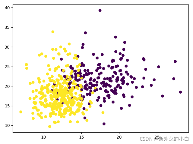
plt.scatter(x[:, 0], x[:, 1], c=y)
plt.show()
看看其中两种特征的可视化结果
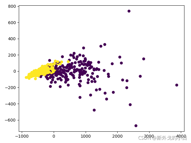
降维到二维空间再看一下
from sklearn.decomposition import PCA
x_dr = PCA(2).fit_transform(x)
#print(x_dr)

plt.scatter(x_dr[:, 0], x_dr[:, 1], c=y)
plt.show()
x_train, x_test, y_train, y_test = train_test_split(x, y, test_size=0.3, random_state=0)

kernel = ["linear", "poly", "rbf", "sigmoid"]


for kernel in kernel:
    time0 = time()
    clf = SVC(kernel=kernel,
              gamma="auto",
              cache_size=5000).fit(x_train, y_train)
    print("The accuracy under kernel %s is %f" % (kernel, clf.score(x_test, y_test)))
    print(datetime.datetime.fromtimestamp(time()-time0).strftime("%M:%S:%f"))

The accuracy under kernel linear is 0.959064
00:01:247745
这种情况下,只输出了linear的结果,卡在了poly上,因为poly多项式默认d(幂次方)为3,我们可以认为是次方太高,计算量过大所以算不出来
for kernel in kernel:
    time0 = time()
    clf = SVC(kernel=kernel,
              gamma="auto",
              degree=1,
              cache_size=5000).fit(x_train, y_train)
    print("The accuracy under kernel %s is %f" % (kernel, clf.score(x_test, y_test)))
    print(datetime.datetime.fromtimestamp(time() - time0).strftime("%M:%S:%f"))


The accuracy under kernel linear is 0.959064
00:01:165836
The accuracy under kernel poly is 0.935673
00:00:059846
The accuracy under kernel rbf is 0.631579
00:00:059675
The accuracy under kernel sigmoid is 0.631579
00:00:006134
rbf 的效果不如linear,真的不应该呀,所以看看数据集本身是什么样子的
import pandas as pd
data = pd.DataFrame(x)
feature_describe = data.describe([0.01, 0.05, 0.1, 0.25, 0.5, 0.75, 0.9, 0.99]).T
#print(feature_describe)
#最好有jupyter notebook来看值,所有的值都能看得到
#可以发现数据存在严重的量纲不一致的情况,我们使用数据预处理中的标准化类,对数据进行归一化处理

from sklearn.preprocessing import StandardScaler
newx = StandardScaler().fit_transform(x)
data = pd.DataFrame(x)
new_describe = data.describe([0.01, 0.05, 0.1, 0.25, 0.5, 0.75, 0.9, 0.99]).T
#print(new_describe)
由于pycharm显示不了全部,所以就不贴图了!肉眼可见我们的数据有不同的量纲,且有一些特征有偏态问题,所以进行了归一化处理。
from sklearn.preprocessing import StandardScaler
newx = StandardScaler().fit_transform(x)
data = pd.DataFrame(x)
new_describe = data.describe([0.01, 0.05, 0.1, 0.25, 0.5, 0.75, 0.9, 0.99]).T
#print(new_describe)
#仍然有一些特征存在偏态的问题

newx_train, newx_test, newy_train, newy_test = train_test_split(newx, y, test_size=0.3, random_state=0)

for kernel in kernel:
    time0 = time()
    clf = SVC(kernel=kernel, gamma="auto", degree=1, cache_size=5000).fit(newx_train, newy_train)
    print("The accuracy under kernel %s is %f" % (kernel, clf.score(newx_test, newy_test)))
    print(datetime.datetime.fromtimestamp(time() - time0).strftime("%M:%S:%f"))

The accuracy under kernel linear is 0.959064
00:00:010021
The accuracy under kernel poly is 0.970760
00:00:006397
The accuracy under kernel rbf is 0.976608
00:00:010460
The accuracy under kernel sigmoid is 0.941520
00:00:003067
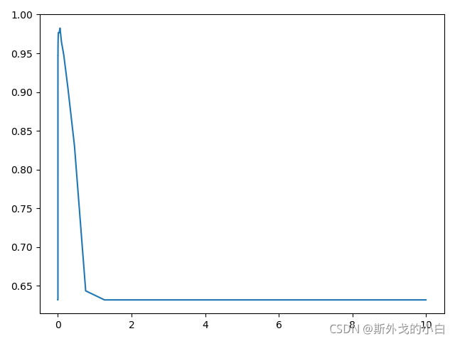
对rbf进行调参
score = []
gamma_range = np.logspace(-10, 1, 50) #返回对数刻度上
#print(gamma_range)


for i in gamma_range:
    clf = SVC(kernel="rbf", gamma=i, cache_size=5000).fit(newx_train, newy_train)
    score.append(clf.score(newx_test, newy_test))

print(max(score), gamma_range[score.index(max(score))])
plt.plot(gamma_range, score)

plt.show()
#0.9824561403508771 0.05689866029018305
对poly调参,通过网格搜索,寻找最好的gamma和r的值cofe表示r的值
from sklearn.model_selection import StratifiedShuffleSplit
from sklearn.model_selection import GridSearchCV

time0 = time()

gamma_range = np.logspace(-10, 1, 20)
coef0_range = np.linspace(0, 5, 10)

param_grid = dict(gamma=gamma_range,
                  coef0=coef0_range)

cv = StratifiedShuffleSplit(n_splits=5, test_size=0.3, random_state=0)
grid = GridSearchCV(SVC(kernel="poly", degree=1, cache_size=5000),
                    param_grid=param_grid, cv=cv)
grid.fit(newx, y)
print("The best parameters are %s with a score of %0.5f" % (grid.best_params_,
grid.best_score_))
print(datetime.datetime.fromtimestamp(time()-time0).strftime("%M:%S:%f"))

The best parameters are {'coef0': 0.0, 'gamma': 0.04832930238571752} with a score of 0.96608
00:11:612675
但是调参的效果还不如不调
4 硬间隔与软间隔:重要参数C

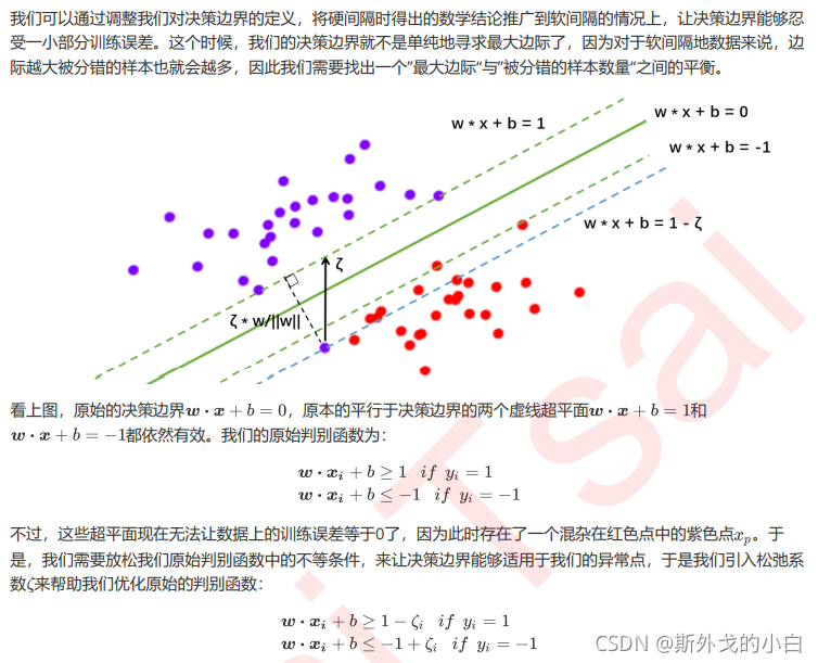
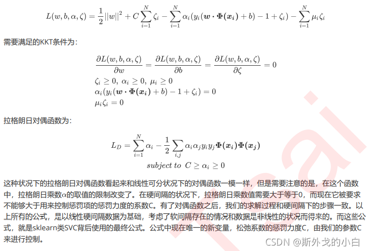
重要参数C

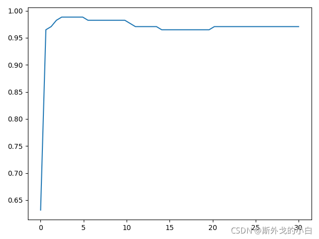
score = []
c_range = np.linspace(0.01, 30, 50)
for i in c_range:
    clf = SVC(kernel="rbf", C=i, gamma=0.05689866029018305, cache_size=5000 #计算内存大小).fit(newx_train, newy_train)
    score.append(clf.score(newx_test, newy_test))
print(max(score), c_range[score.index(max(score))])
#0.9883040935672515 2.4581632653061223
plt.plot(c_range, score)
plt.show()

#0.9883040935672515 2.4581632653061223