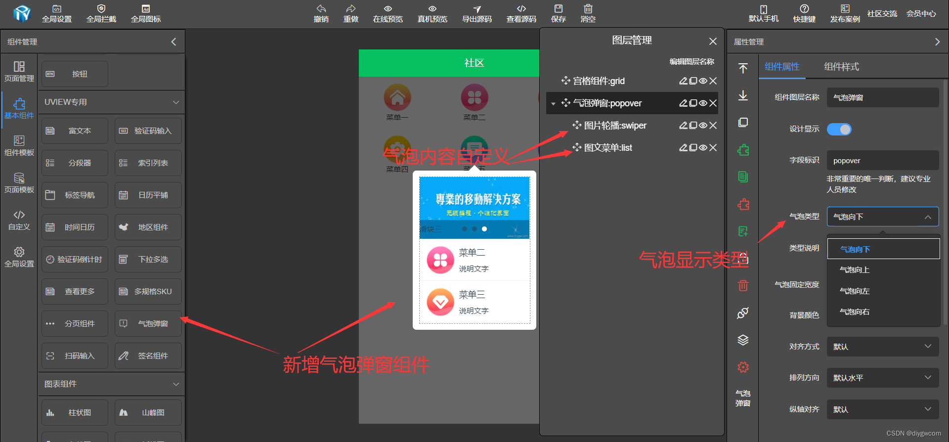
DIY可视化打造的基于vue+uniapp下拉气泡组件
下拉气泡组件在使用场景里非常常用,比较快速分类选择、点击弹出操作按钮等,DIY可视化支持自定义下拉气泡组件里的内容,达到非常灵活的气泡效果而不单一。
最常见微信里右上角三个点 => 展开下拉菜单 => 点击下拉菜单的某个功能 进入功能界面。
<template>
	<view v-if="visibleSync" :style="[customStyle, {
		zIndex: uZindex - 1
	}]" class="diy-popover" hover-stop-propagation>
		<u-mask :blur="blur" :duration="duration" :custom-style="maskCustomStyle" :maskClickAble="maskCloseAble"
			:z-index="uZindex - 2" :show="showDrawer && mask" @click="maskClick"></u-mask>
		<!-- 移除	@tap.stop.prevent -->
		<view class="popover" :class="[
				safeAreaInsetBottom ? 'safe-area-inset-bottom' : '',
				showDrawer ? 'diy-popover-visible' : ''
			]" @touchmove.stop.prevent
			:style="{width:width,background:diybgcolor,'--arrow-color':diybgcolor,top: popoverTop ,left: popoverLeft}">
			<text :class="['popover-'+diymode,'popover-'+dynPlace]" :style="{width:'0px',height:'0px'}"></text>
			<slot></slot>
		</view>
	</view>
</template>

<script>
	/**
	 * popover 汽泡组件
	 * @description 汽泡组件,用于汽泡组件、信息提示等内容,支持上、下、左、右和中部弹出。组件只提供容器,内部内容由用户自定义
	 * @property {String} mode 弹出方向(默认left)
	 * @property {Boolean} mask 是否显示遮罩(默认true)
	 * @property {Stringr | Number} length mode=top
	 * @property {Boolean} zoom 是否开启缩放动画,只在mode为center时有效(默认true)
	 * @property {Boolean} safe-area-inset-bottom 是否开启底部安全区适配(默认false)
	 * @property {Boolean} mask-close-able 点击遮罩是否可以关闭弹出层(默认true)
	 * @property {Numberr | String} z-index 弹出内容的z-index值(默认1075)
	 * @event {Function} open 弹出层打开
	 * @event {Function} close 弹出层收起
	 */

	export default {
		name: 'diy-popover',
		emits: ["update:modelValue", "input", "open", "close"],
		props: {
			value: {
				type: Boolean,
				default: false
			},
			modelValue: {
				type: Boolean,
				default: false
			},
			/**
			 * 弹出方向,left|right|top|bottom
			 */
			mode: {
				type: String,
				default: 'top-center'
			},
			/**
			 * 是否显示遮罩
			 */
			mask: {
				type: Boolean,
				default: true
			},
			// 是否开启底部安全区适配,开启的话,会在iPhoneX机型底部添加一定的内边距
			safeAreaInsetBottom: {
				type: Boolean,
				default: false
			},
			// 是否可以通过点击遮罩进行关闭
			maskCloseAble: {
				type: Boolean,
				default: true
			},
			// 显示显示弹窗的圆角,单位rpx
			borderRadius: {
				type: [Number, String],
				default: 0
			},
			zIndex: {
				type: [Number, String],
				default: ''
			},
			// 背景颜色
			bgcolor: {
				type: String,
				default: '#fff'
			},
			// 点击元素左边坐标
			triggerLeft: {
				type: [String, Number],
				default: 0
			},
			// 点击元素上方坐标
			triggerTop: {
				type: [String, Number],
				default: 0
			},
			// 点击元素高度
			triggerHeight: {
				type: [String, Number],
				default: 12
			},
			// 点击元素宽度
			triggerWidth: {
				type: [String, Number],
				default: 24
			},
			width: {
				type: String,
				default: '200px'
			},
			// 遮罩的样式,一般用于修改遮罩的透明度
			maskCustomStyle: {
				type: Object,
				default () {
					return {
						backgroundColor: 'none'
					}
				}
			},
			// 遮罩打开或收起的动画过渡时间,单位ms
			duration: {
				type: [String, Number],
				default: 250
			},
			// 遮罩的模糊度
			blur: {
				type: [String, Number],
				default: 0
			},

		},
		data() {
			return {
				diymode: this.mode,
				popoverTransform: 'scale(1)',
				popoverTop: '0px',
				popoverLeft: '0px',
				diybgcolor: this.bgcolor ? this.bgcolor : '#fff',
				visibleSync: false,
				showDrawer: false,
				timer: null,
				dynPlace: '',
				closeFromInner: false, // value的值改变,是发生在内部还是外部
			};
		},
		computed: {
			valueCom() {
				// #ifndef VUE3
				return this.value;
				// #endif

				// #ifdef VUE3
				return this.modelValue;
				// #endif
			},
			// 计算整理后的z-index值
			uZindex() {
				return this.zIndex ? this.zIndex : this.$u.zIndex.popup;
			}
		},
		watch: {
			valueCom(val) {
				if (val) {
					this.open();
					this.popoverPosition()
				} else if (!this.closeFromInner) {
					this.close();
				}
				this.closeFromInner = false;
			},
		},
		mounted() {
			if (this.mode.indexOf("-") > 0) {
				this.diymode = this.mode.substring(0, this.mode.indexOf("-"))
			} else {
				this.diymode = this.mode
			}
			// 组件渲染完成时,检查value是否为true,如果是,弹出popup
			this.valueCom && this.open();
		},
		methods: {
			getTopOrBottomPlacement(wrapperwidth) {
				let width = uni.getSystemInfoSync().windowWidth
				//X坐标大于屏幕一半大小且大于屏幕的大小时
				if (this.triggerLeft + this.triggerWidth / 2 + wrapperwidth / 2 - width > 0) {
					return 'end'
				} else if (this.triggerLeft + this.triggerWidth / 2 - wrapperwidth / 2 > 0) {
					return 'center'
				} else {
					return 'start'
				}
			},
			getLeftOrRightPlacement(wrapperHeight) {
				let height = uni.getSystemInfoSync().windowHeight
				if (this.triggerTop + this.triggerHeight / 2 + wrapperHeight / 2 - height > 0) {
					return 'end'
				} else if (this.triggerTop + this.triggerHeight / 2 - wrapperHeight / 2 > 0) {
					return 'center'
				} else {
					return 'start'
				}
			},
			async popoverPosition() {
				let statusBar = await this.getStatusBar()
				let promise = new Promise((resolve, reject) => {
					let popoverDom = uni.createSelectorQuery().in(this).select(".popover")
					popoverDom.fields({
						size: true,
					}, (data) => {
						let width = data.width
						let height = data.height
						let y = this.triggerTop + statusBar
						let x = this.triggerLeft
						this.dynPlace = this.mode

						if (this.mode == 'top' || this.mode == 'bottom') {
							this.dynPlace = this.mode + "-" + this.getTopOrBottomPlacement(width)
						} else if (this.mode == 'left' || this.mode == 'right') {
							this.dynPlace = this.mode + "-" + this.getLeftOrRightPlacement(height)
						} else {

							this.dynPlace = this.mode
						}

						let popoverTop = 0
						let popoverLeft = 0
						switch (this.dynPlace) {
							case 'top-left':
								y = y + this.triggerHeight + 9
								popoverTop = `${y}px`
								x = x - 10
								x = x < 0 ? 2 : x
								popoverLeft = `${x}px`
								this.popoverLeft = popoverLeft
								this.popoverTop = popoverTop
								break;
							case 'top-center':
								y = y + this.triggerHeight
								popoverTop = `${y+9}px`
								x = x + this.triggerWidth / 2 - width / 2
								x = x < 0 ? 2 : x
								popoverLeft = `${x}px`
								this.popoverLeft = popoverLeft
								this.popoverTop = popoverTop
								break;
							case 'top-right':
								y = y + this.triggerHeight
								this.popoverTop = `${y+9}px`
								x = x + this.triggerWidth - width
								this.popoverLeft = `${x}px`
								break;
							case 'top-left':
								this.popoverTop = `${y-12-height}px`
								x = x - 10
								x = x < 0 ? 2 : x
								this.popoverLeft = `${x}px`
								break;
							case 'bottom-center':
								this.popoverTop = `${y-12-height}px`
								x = x + this.triggerWidth / 2 - width / 2
								x = x < 0 ? 2 : x
								popoverLeft = `${x}px`
								this.popoverLeft = popoverLeft
								break;
							case 'bottom-right':
								this.popoverTop = `${y-12-height}px`
								x = x + this.triggerWidth - width
								this.popoverLeft = `${x}px`
								break;
							case 'left-top':
								this.popoverTop = `${y}px`
								this.popoverLeft = `${x -width -15}px`
								break;
							case 'left-center':
								y = y - height / 2 + this.triggerHeight / 2
								this.popoverTop = `${y}px`
								this.popoverLeft = `${x -width -15}px`
								break;
							case 'left-bottom':
								y = y - height + this.triggerHeight + 5
								this.popoverTop = `${y}px`
								this.popoverLeft = `${x - width -15}px`
								break;
							case 'right-top':
								this.popoverTop = `${y}px`
								x = x + this.triggerWidth + 15
								this.popoverLeft = `${x}px`
								break;
							case 'right-center':
								y = y - height / 2 + this.triggerHeight / 2
								this.popoverTop = `${y}px`
								x = x + this.triggerWidth + 15
								this.popoverLeft = `${x}px`
								break;
							case 'right-bottom':
								y = y - height + this.triggerHeight + 5
								this.popoverTop = `${y}px`
								x = x + this.triggerWidth + 15
								this.popoverLeft = `${x}px`
								break;
						}
						resolve()
					}).exec();

				})
				return promise
			},
			getStatusBar() {
				let promise = new Promise((resolve, reject) => {
					uni.getSystemInfo({
						success: function(e) {
							let customBar
							// #ifdef H5
							customBar = e.statusBarHeight + e.windowTop;
							// #endif
							resolve(customBar)
						}
					})
				})
				return promise
			},
			// 判断传入的值,是否带有单位,如果没有,就默认用rpx单位
			getUnitValue(val) {
				if (/(%|px|rpx|auto)$/.test(val)) return val;
				else return val + 'rpx'
			},
			// 遮罩被点击
			maskClick() {
				this.close();
			},
			close() {
				// 标记关闭是内部发生的,否则修改了value值,导致watch中对value检测,导致再执行一遍close
				// 造成@close事件触发两次
				this.closeFromInner = true;
				this.change('showDrawer', 'visibleSync', false);
			},
			open() {
				this.change('visibleSync', 'showDrawer', true);
			},
			// 此处的原理是,关闭时先通过动画隐藏弹窗和遮罩,再移除整个组件
			// 打开时,先渲染组件,延时一定时间再让遮罩和弹窗的动画起作用
			change(param1, param2, status) {
				// 如果this.popup为false,意味着为picker,actionsheet等组件调用了popup组件
				if (this.popup == true) {
					this.$emit('input', status);
				}
				this.$emit("update:modelValue", status);
				this[param1] = status;
				if (status) {
					// #ifdef H5 || MP
					this.timer = setTimeout(() => {
						this[param2] = status;
						this.$emit(status ? 'open' : 'close');
					}, 50);
					// #endif
					// #ifndef H5 || MP
					this.$nextTick(() => {
						this[param2] = status;
						this.$emit(status ? 'open' : 'close');
					})
					// #endif
				} else {
					this.timer = setTimeout(() => {
						this[param2] = status;
						this.$emit(status ? 'open' : 'close');
					}, this.duration);
				}
			}
		}
	};
</script>

<style scoped lang="scss">
	@import "../../libs/css/style.components.scss";

	.diy-popover {
		/* #ifndef APP-NVUE */
		display: block;
		/* #endif */
		position: fixed;
		top: 0;
		left: 0;
		right: 0;
		bottom: 0;
		overflow: hidden;
	}

	.popover {
		position: absolute;
		padding: 20rpx;
		z-index: 99999999;
		border-radius: 10rpx;
		display: flex;
		transition: opacity .15s, transform .15s;
		box-shadow: 0upx 0upx 30upx rgba(0, 0, 0, 0.2);

		.popover-top:after {
			content: "";
			position: absolute;
			border-width: 0 20rpx 20rpx;
			border-style: solid;
			border-color: transparent transparent var(--arrow-color);
		}

		.popover-top-left:after {
			top: -18rpx;
			left: 10rpx;
		}

		.popover-top-center:after {
			top: -18rpx;
			right: 50%;
			transform: translateX(50%);
		}

		.popover-top-right:after {
			top: -18rpx;
			right: 10rpx;
		}


		.popover-bottom:after {
			content: "";
			position: absolute;
			border-width: 20rpx 20rpx 0;
			border-style: solid;
			border-color: var(--arrow-color) transparent transparent;
		}

		.popover-bottom-left:after {
			bottom: -18rpx;
			left: 10rpx;
		}

		.popover-bottom-center:after {
			bottom: -18rpx;
			right: 50%;
			transform: translateX(50%);
		}

		.popover-bottom-right:after {
			bottom: -18rpx;
			right: 10rpx;
		}

		.popover-left:after {
			content: "";
			position: absolute;
			border-width: 20rpx 0 20rpx 20rpx;
			border-style: solid;
			border-color: transparent transparent transparent var(--arrow-color);
		}

		.popover-left-top:after {
			top: 10rpx;
			right: -18rpx;
		}

		.popover-left-center:after {
			top: 50%;
			right: -18rpx;
			transform: translateY(-50%);
		}

		.popover-left-bottom:after {
			bottom: 10rpx;
			right: -18rpx;
		}

		.popover-right:after {
			content: "";
			position: absolute;
			border-width: 20rpx 20rpx 20rpx 0;
			border-style: solid;
			border-color: transparent var(--arrow-color) transparent transparent;
		}

		.popover-right-top:after {
			top: 10rpx;
			left: -18rpx;
		}

		.popover-right-center:after {
			top: 50%;
			left: -18rpx;
			transform: translateY(-50%);
		}

		.popover-right-bottom:after {
			bottom: 10rpx;
			left: -18rpx;
		}

	}


	.diy-popover-visible {
		transform: translate3D(0px, 0px, 0px) !important;
	}
</style>